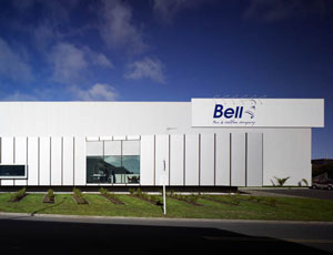
Wingate & Farquhar’s long, linear form for a New Zealand company steeped in tradition.
The day the tea ran out Reporoa. October. 1993 – I’d decided to spend the day reading a novel on a sun-drenched couch while drinking cups of milky, sugary tea. From memory, the novelist was lain Banks and the tea was Bell Original (this was. after all. the provinces. and it was well before any of these Jhoti-come-lately Sri Lankan teas gained any traction in the market). I don’t recall much, if anything. about the couch The kettle was doing that thing where the pitch of the bubbling deepens for about three seconds before it flicks off. I swung open the fridge door and spied not a skerrick of milk. Desperately I checked the pantry for some UHT but my fears were confirmed – we were absolutely Mother Hubbard.
I stared at the tea bag steeping in the cup, the harsh tannins insinuating themselves into the brew. Would I be able to handle their astringency without the help of the masking milk proteins? I sighed. dumped in a teaspoon of sugar and adjourned to the couch.
In retrospect. I can’t think of another time when such a minor incident has had such a positive effect on my life. Six milk less cups of tea later I was changed forever. My appreciation for the subtleties of tea began that day 16 years ago and has been evolving ever since. Where once I ordered “milk and two,” now it’s “just black, thanks: Where once I was embarrassed by my Jack of sophistication, now I feel qualified to hold court on the origin of my tea. the structure. the tannins-unspoiled as it is by the bourgeois affectations of milk and sugar. It remains unclear whether ProDesign’s editor knew of my fondness for tea when he assigned me the story about Wingate & Farquhar’s design of the Bell Tea & Coffee facilities out at Highgate. near East Tamaki.
The morning I arranged to meet architect David Wingate at Bell, there was such a ferocious deluge that I half expect to see animals filing two by two down the road. It’s grey and gusty. so it’s not the best day to appreciate a semi. industrial area but it sure is a great day for drinking tea. Once we’re inside, David Wingate explains that the building’s one-level design arose for both philosophical and practical reasons.
“The company philosophy is a flat management structure where everyone is treated equally. Having everyone working on one. open-plan level helps to reinforce that and encourage workers to interact. We also saved money and space by not needing a stairwell or an elevator,” he says.
Wingate & Farquhar delivered an office design strategy that shows an uncanny knowledge of how so-called ‘flat management structures’ work. Often the upper management will adopt a ‘do as I say, not s I do’ attitude and exempt themselves from the open plan. Wingate’s design ensured any who might be of that persuasion would think twice about that.
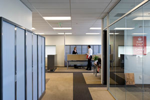
“We deliberately made sure the open-plan workers had the best views and those who were in offices didn’t. If you wanted to work undisturbed. that’s fine.but you wouldn’t get the benefit of the views and natural sunlight. But then if you’re working so hard. you shouldn’t be staring out the window in the first place should you?” he says with a smile.
As a result. only those who really need an office have one. The old ‘corner office with a view: the very emblem of hierarchy and elitism. is nowhere to be seen.
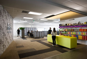
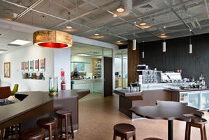
The detailing on the workstations uses materials from the adjacent warehouse. which represent Bell’s core business. tea and coffee. The notice boards are made from coffee sacks. as are many of the communal light `shades. I mean it as a definite compliment when I say that it’s the type of office that workers feel they can leave the newspaper on the table. It feels lived in – which is a great quality for a building that”s only been occupied for 9 months.
The building reminds workers that Bell’s goal is to create the best tea and coffee they possibly can. while always remembering where -the company came from. The boardroom is fairly simple by modern standards. while still containing all the multimedia equipment necessary. What is notable though is the sense of history in the room. Next to the multimedia equipment sits ancient Bell tea tins. photos of all the significant Bell figures since 1898 and old ledgers filled with immaculate penmanship.
To further link the corporate and manufacturing sides of the company; the boardroom also has a narrow internal window that looks into the tea and coffee tasting rooms. Wingate is rightfully proud of the tasting rooms and he tells me the tea tasting room is widely considered to be the foremost example in Australasia. This is largely due to a glass roof panel above the bench. which catches light from the reflective cladding above. While it wasn’t evident on the rainy day I visited. tea taster Matt Greenwood says viewing the colour of the tea under good natural light is vastly superior to artificial.
Wingate has designed the north-facing side of the building differently than others in the area. Instead of installing louvres to block out the sun. he has gone for narrower windows in the work areas and a large floor-to-ceiling window in the communal area, where some heat gain is acceptable. All this allows views out to the tea bushes that separate the building from the road.
Beside the communal area. the cafe has two tables in the shape of the North and South Islands (even an internal fish bowl for Lake Taupo) and a much smaller one in the shape of Australia. It’s an informal space and workers can even write company business on the chalkboard walls.
The internal ‘street’ that visitors arrive into separates the warehouse and the branded corporate area. The reception area has artfully arranged stacks of all Bell’s products behind it and a warm ‘hello’ written on the green counter. Iconic photos of the Bell-sponsored Olympian Mark Todd sit just off to the side.
David Wingate sums up his design philosophy for the building. “I want the company to be able to grow into the building. It’s a canvas and as they change and celebrate more and more milestones it will come to reflect their developing identity.”
Selected credits
Client Bell Tea and Coffee Company
Architect Wingate+Farquhar
Main contractor Aspec Construction
Paint Resene
Flooring Irvine International (Carpet llle}. Jacobsens (Vinyl}. James Halstead Flooring (Marrno!eurn)
Lighting Eunice Taylor (Table Lamps)
Workstation desks, chairs, cabinetry Workstations from Eclectic Furniture; task chairs from Cite; storage from Europ!an
Boardroom tables, chairs Boardroom tab!e from Corporate Culture; boardroom chairs from Kada: meeting chairs from Titan Furniture
Waiting furniture Ottoman from Finewood
Other furniture Sharp & Page: Montage Interiors
Cushions Ingrid Anderson Textiles: Window Design Centre
Slgnage Sign Craftsmen
Display fittings Pizazz
Specialist wall linings Shears & Mac
Feature wall Piper Traders
Words: Anthony Coates.
Images: Simon Devitt.

Unexpectedly, but quite appropriately, rows of tea plants line the foreground of the Bell Tea & Coffee Company head office in East Tamaki, Auckland.

Tea and coffee tasting laboratories are now major hubs of the office. The highly visible spaces are adjacent the cafe. Vision strips In meeting rooms provide glimpses Into these labs.

The ‘Centre of Gravity’ café, above. Gravity Coffee is one of Bell’s brands. The furniture pieces were custom-made to represent a geometric map of New Zealand (a built-in fishbowl indicates Lake Taupo). The pendant lights are covered with coffee-sack cloth, and many other references to the coffee and tea trade abound throughout.

